Marketing Consulting Agency
A clean and optimistic identity for
a marketing brand, using upward movement, fresh colors, and simple geometric shapes
to communicate strategic growth, brand clarity, and measurable results.
The main horizontal logo lockup, ideal for websites, business cards, stationery, presentations, and other spaces where the full brand name can be shown clearly

A more compact version
of the identity, useful when the full primary logo needs more visual presence or when the layout calls for a stacked composition.

A simplified brand mark
that keeps the upward movement of the identity while working well in smaller spaces, social media, stickers, and supporting brand moments.

The most minimal version of the identity, designed for icons, favicons, stamps, patterns, and places where quick recognition is needed.
A fresh teal, blue, and green palette balances energy with trust — communicating growth, clarity, and optimism while staying professional and grounded.
Danube gives the identity a playful, distinctive personality and reinforces the friendly tone
of the brand while Century Gothic adds clarity
and balance, keeping supporting text clean, readable, and professional.
Danube
a b c d e f g h i j k l m n o p q r s t u v w x y z
Century Gothic
Aa Bb Cc Dd Ee Ff Gg Hh Ii Jj Kk Ll Mm Nn Oo Pp Qq Rr Ss Tt Uu Vv Ww Xx Yy Zz
A simple set of logo-derived elements built
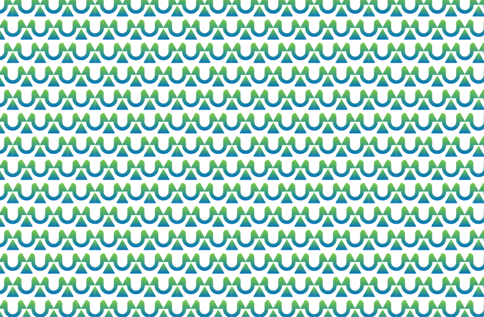
from the UP logo mark, including standalone symbols and a repeatable pattern for branded backgrounds and supporting visuals.
Simplified Mark
Repeat Pattern
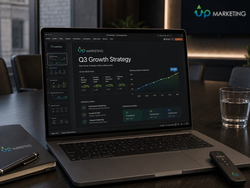
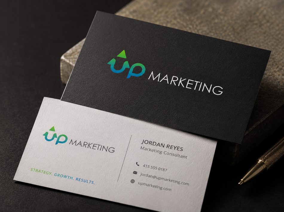
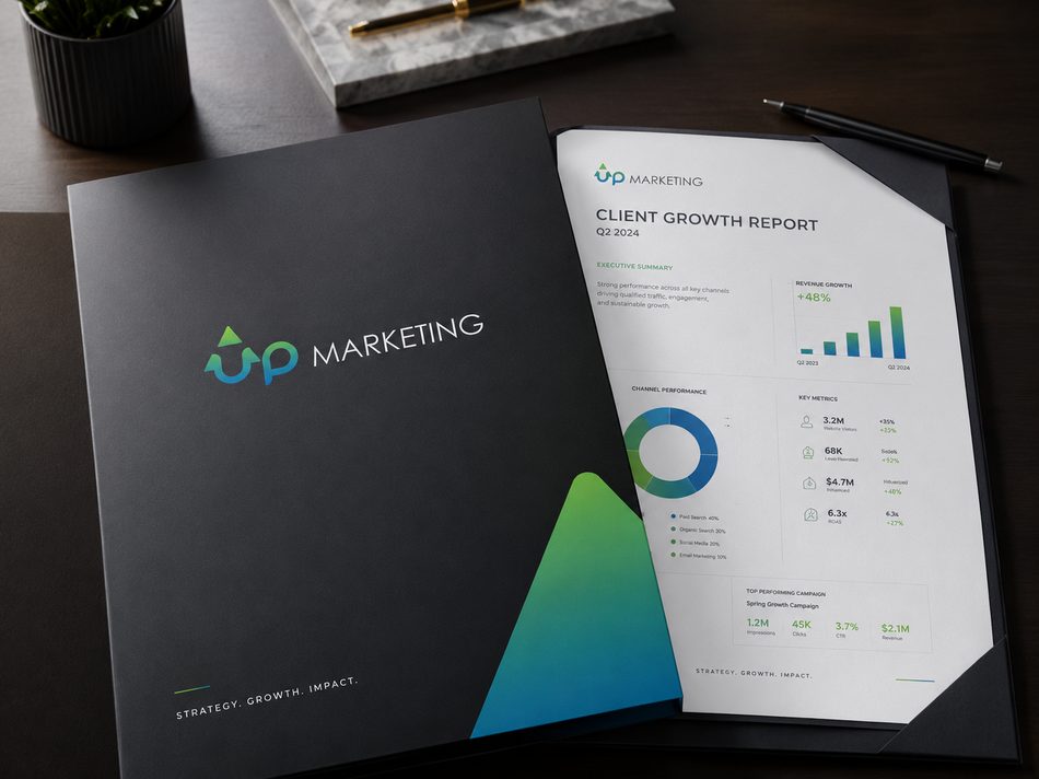
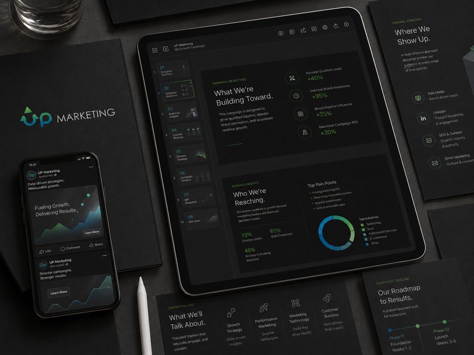
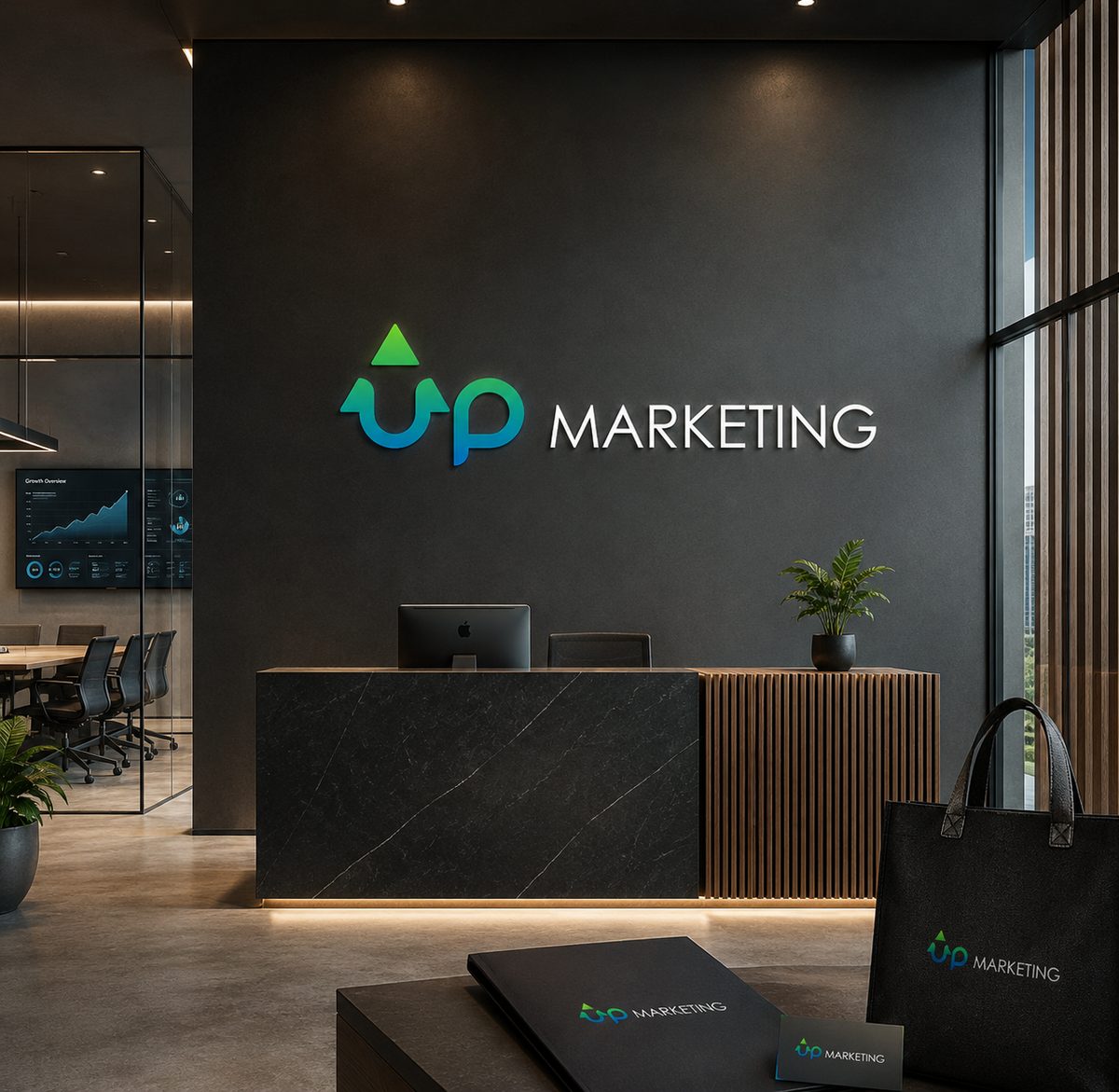
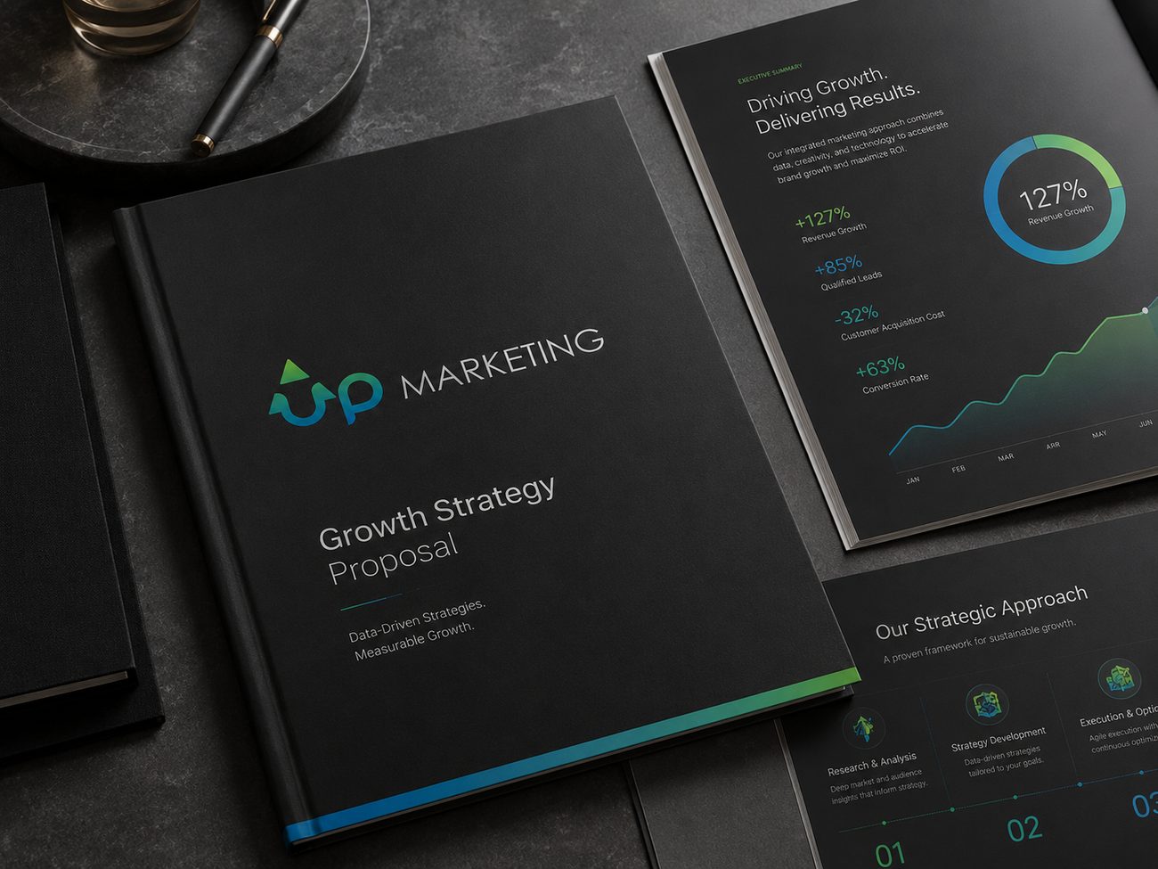
Selected applications that bring the UPmarketing identity into real business contexts — from strategy proposals and client reports to digital campaign presentations.
Campaign proposal
Presentation Deck
Business Card
Client Folder
Digital Reports
Vegetarian Restaurant
A warm and balanced identity for
a vegetarian restaurant, using a lotus-inspired symbol, soft natural colors,
and rounded typography to communicate purity, harmony, and mindful dining.
designed for storefront signage, menus, packaging, digital use, and other brand touch points where the full restaurant name should be clearly visible.
A stacked version
of the identity, useful for layouts where the logo needs a stronger visual presence or a more compact composition.
A circular mark that combines the lotus symbol and brand name, ideal for stickers, packaging details, social media, stamps, and smaller branded moments.
The simplified lotus symbol, designed
for decorative use, patterns, icons, packaging accents,
and spaces where the brand can be recognized without the full name.
A natural palette of warm red, soft pink, pale amber, and fresh green tones, creating a feeling of warmth, balance, freshness, and approachability.
Danube gives the brand a soft, distinctive personality, adding warmth and a handcrafted feeling to the restaurant’s visual language.
Bank Gothic adds structure and clarity, balancing the softness with a clean, modern supporting style.
Danube
a b c d e f g h i j k l m n o p q r s t u v w x y z
Bank Gothic
Aa Bb Cc Dd Ee Ff Gg Hh Ii Jj Kk Ll Mm Nn Oo Pp Qq Rr Ss Tt Uu Vv Ww Xx Yy Zz
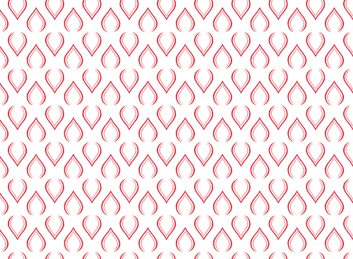
A simple set of lotus-inspired elements, including
a repeatable pattern and standalone symbol variations, extends the Tian Ran identity beyond
the logo while keeping the visual language calm, natural, and recognizable.
Repeat Pattern
Simplified Mark
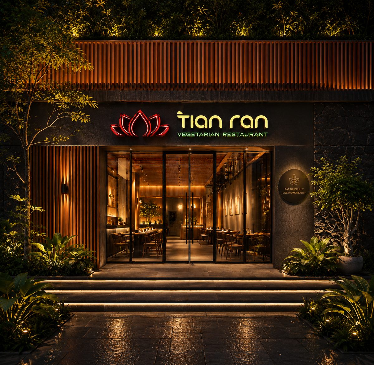
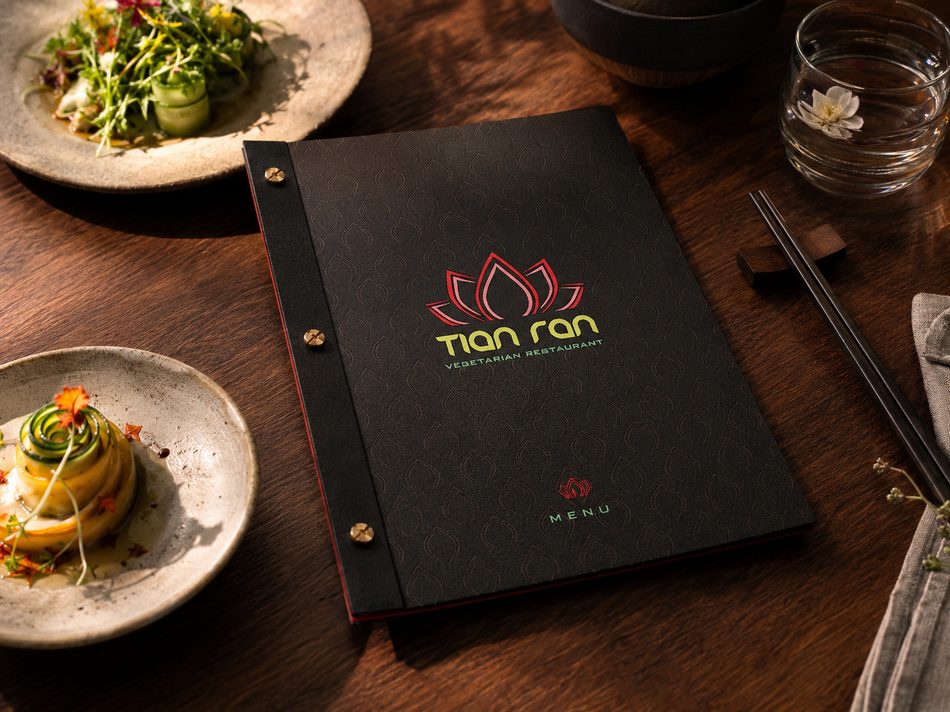
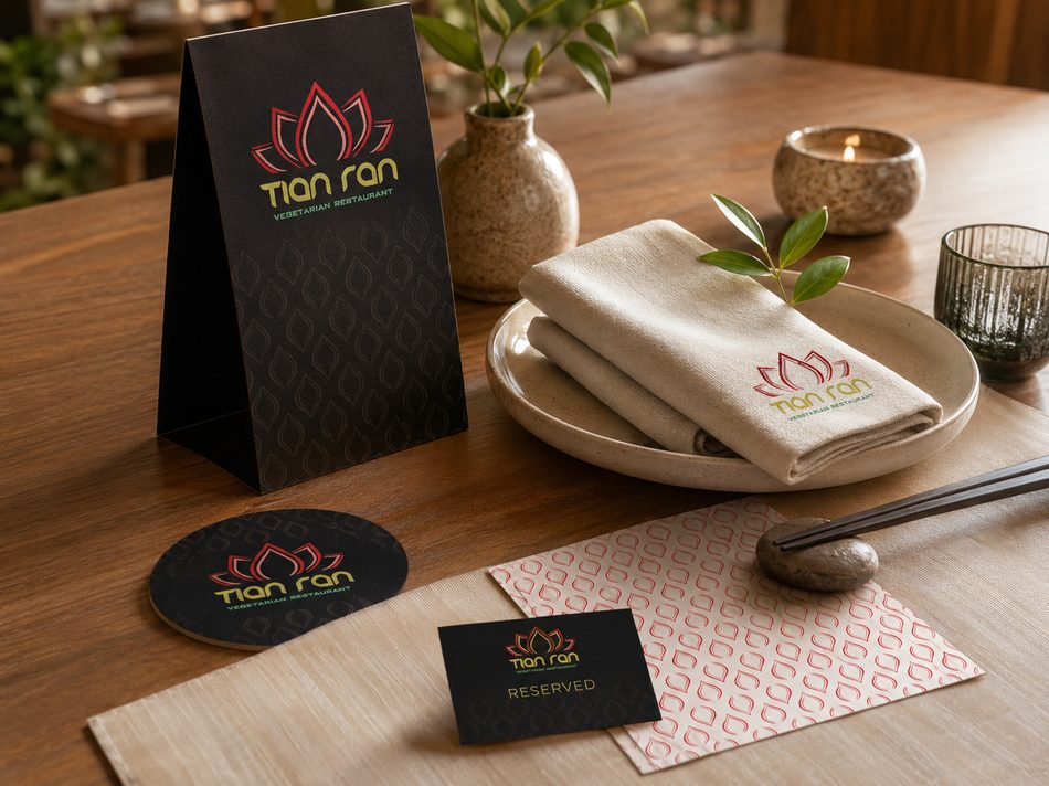
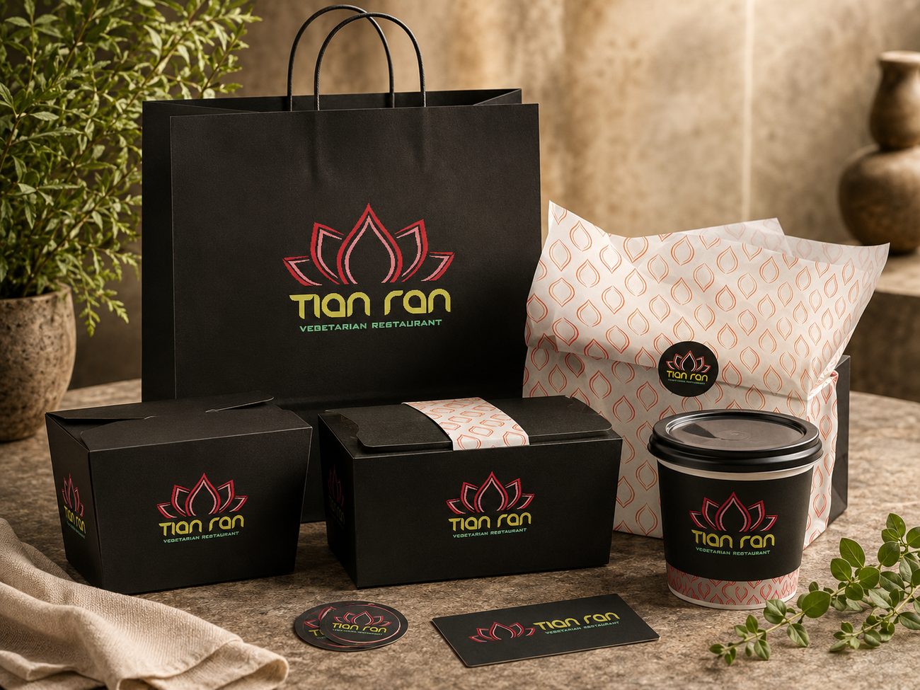
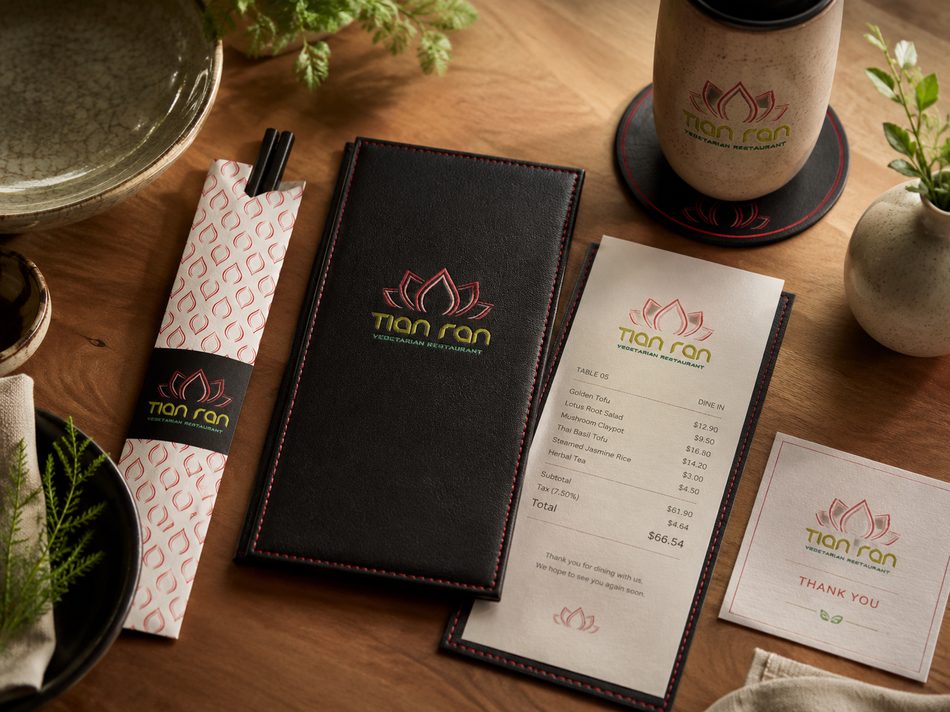
Selected applications showing how the Tian Ran identity comes to life across restaurant touchpoints, from storefront signage and menus to takeaway packaging and branded dining materials.
Menu
Table Setting
Takeaway Set
Bill Card
Tea Ritual
Photographer
A refined and editorial identity, using minimal typography, a circular lens-inspired mark, and a cool monochrome palette with subtle neon accents to communicate focus, clarity, and visual precision.
designed for portfolio websites, business cards, print materials, image watermarks, and other spaces where the photographer’s name should appear clearly and elegantly.
A stacked version of the identity, useful for layouts that need a stronger typographic presence or a more compact composition.
A circular monogram mark built around
the initials, ideal for stickers, profile images, image seals, packaging details, and smaller branded moments.
The simplified circular mark, designed for watermarks, favicons, print seals, and spaces where the identity
needs to remain minimal and recognizable.
Code Bold gives the identity a clean, structured,
and contemporary feel, supporting the sharp editorial tone of the photographer’s visual work.
Code Bold
a b c d e f g h i j k l m n o p q r s t u v w x y z
Roboto ExtraLight adds contrast and refinement, balancing the bold primary type with a lighter, more elegant supporting voice.
Roboto ExtraLight
Aa Bb Cc Dd Ee Ff Gg Hh Ii Jj Kk Ll Mm Nn Oo Pp Qq Rr Ss Tt Uu Vv Ww Xx Yy Zz
A restrained palette of charcoal, slate blue, pale sky, and bright green-yellow creates a cool editorial foundation with a subtle accent of energy.
The circular mark extends the identity into a compact visual signature, creating a flexible seal-like element that can be used across print, digital, and photographic touch points.
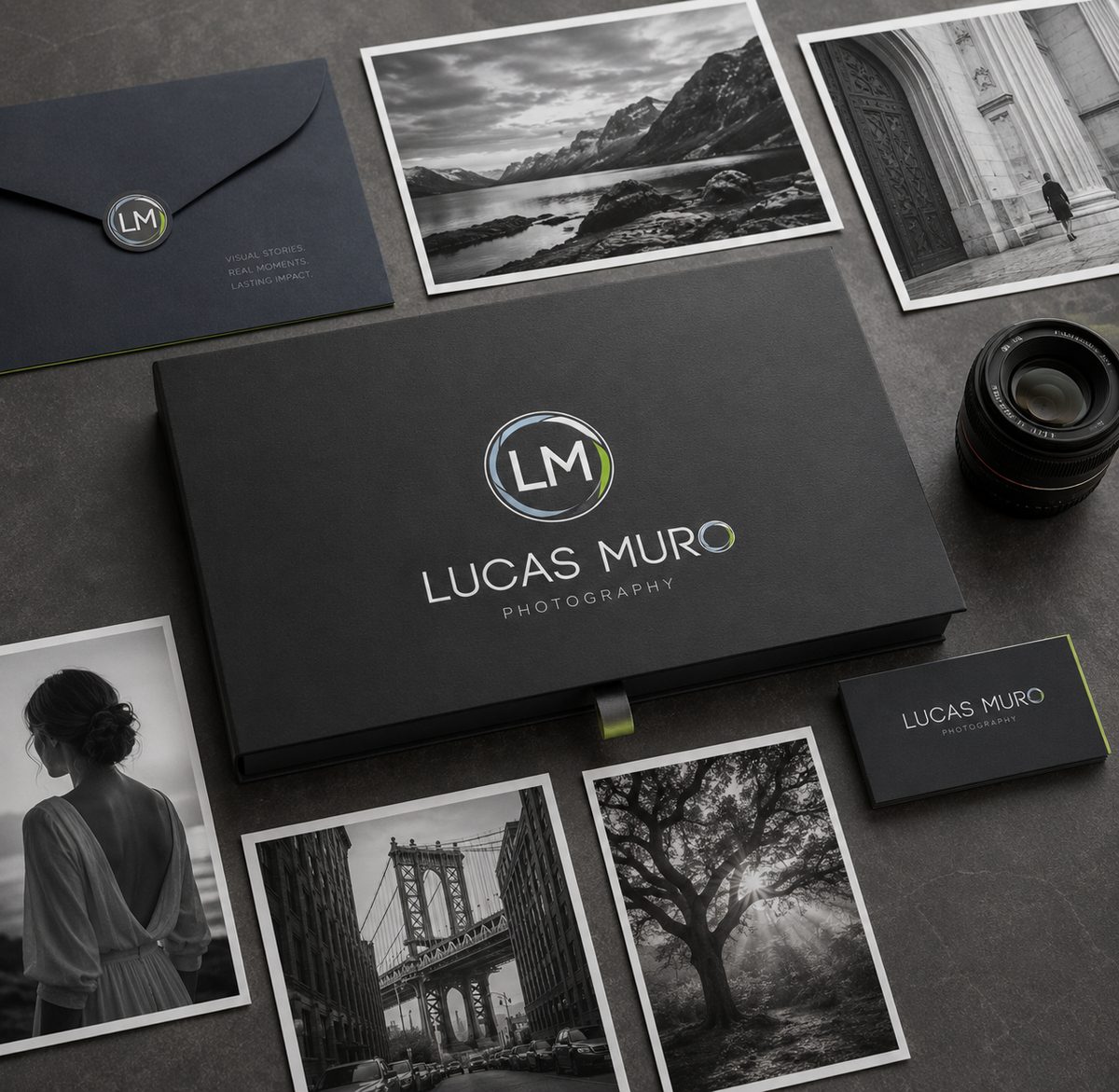
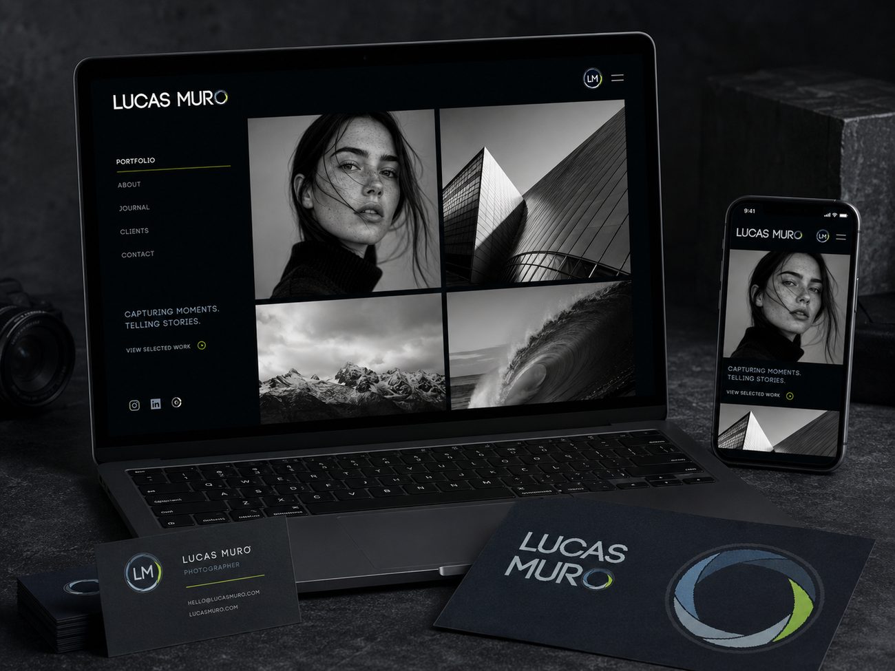
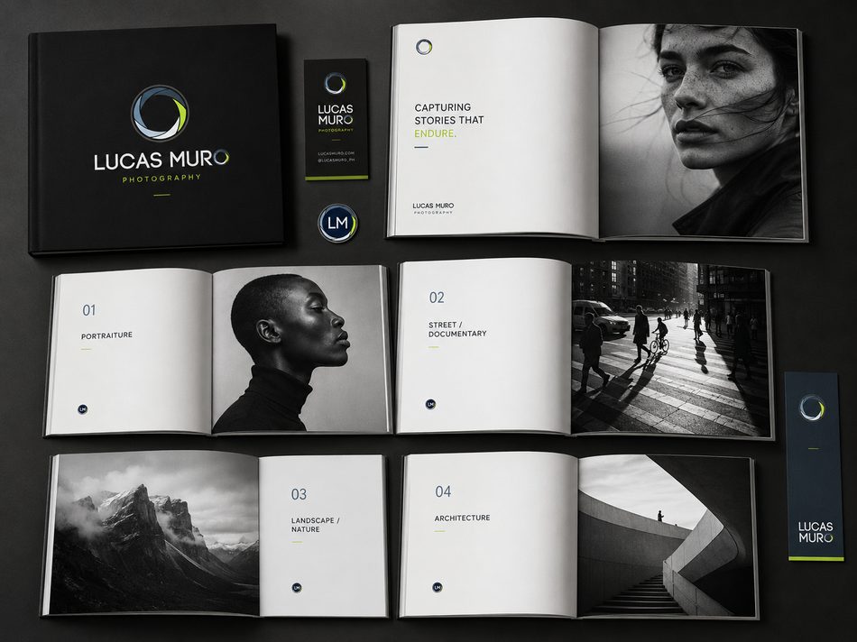
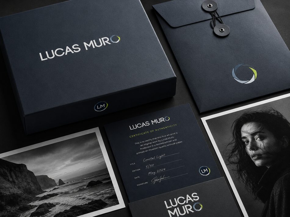
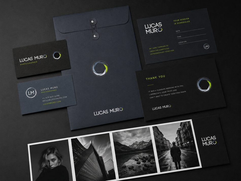
Selected applications showing how the Lucas Muro identity works across editorial photography materials, from portfolio presentations and print packaging to business cards, digital presence, and image-based collateral.
Website
Portfolio Book
Print Material
Client Deliverables